
DTL OTMaster: A superb tool to help understand the OpenType font file format
Introduction
Microsoft’s official specification for the OpenType font file format is a somewhat dry and, of course, a very technical document. Reading through it is not a task for the faint-hearted! I’m interested to understand some parts of it so I recently purchased a copy of DTL OTMaster which has proved to be absolutely invaluable. At the time of writing DTL OTMaster costs about 250 euros but the time it can save you makes it worth every penny. This post is not intended as an “advert” for the software, just a quick demo of a really great tool that you may not have heard of; so here are some screenshots of what it will show you. In the screenshots below, OTMaster is displaying the open source OpenType (TrueType) font Scheherazade .
Screenshots
Here are some screenshots showing the internals of Scheherazade. Programmers will note that you are provided with information on the data types of various entries – the same data types referenced in Microsoft’s specification. Very useful indeed! It’s worth noting that OTMaster has many other features in addition to displaying the technical data – including some features present in Microsoft’s VOLT – and in some areas they are better implemented than in VOLT, particularly the ability to preview multiple glyphs with mark-to-base positioning.
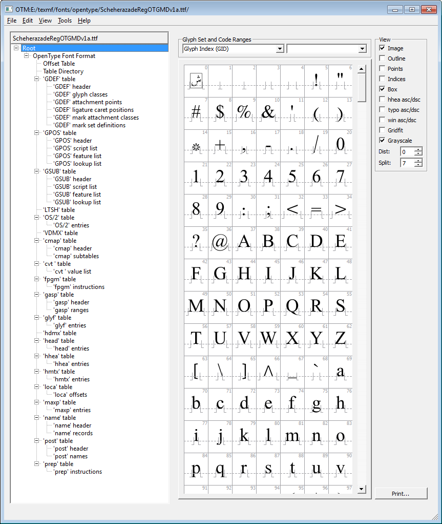
The “root”
On the left is the internal font structure: at the top is the “root” entry where you can see the glyphs in the font.
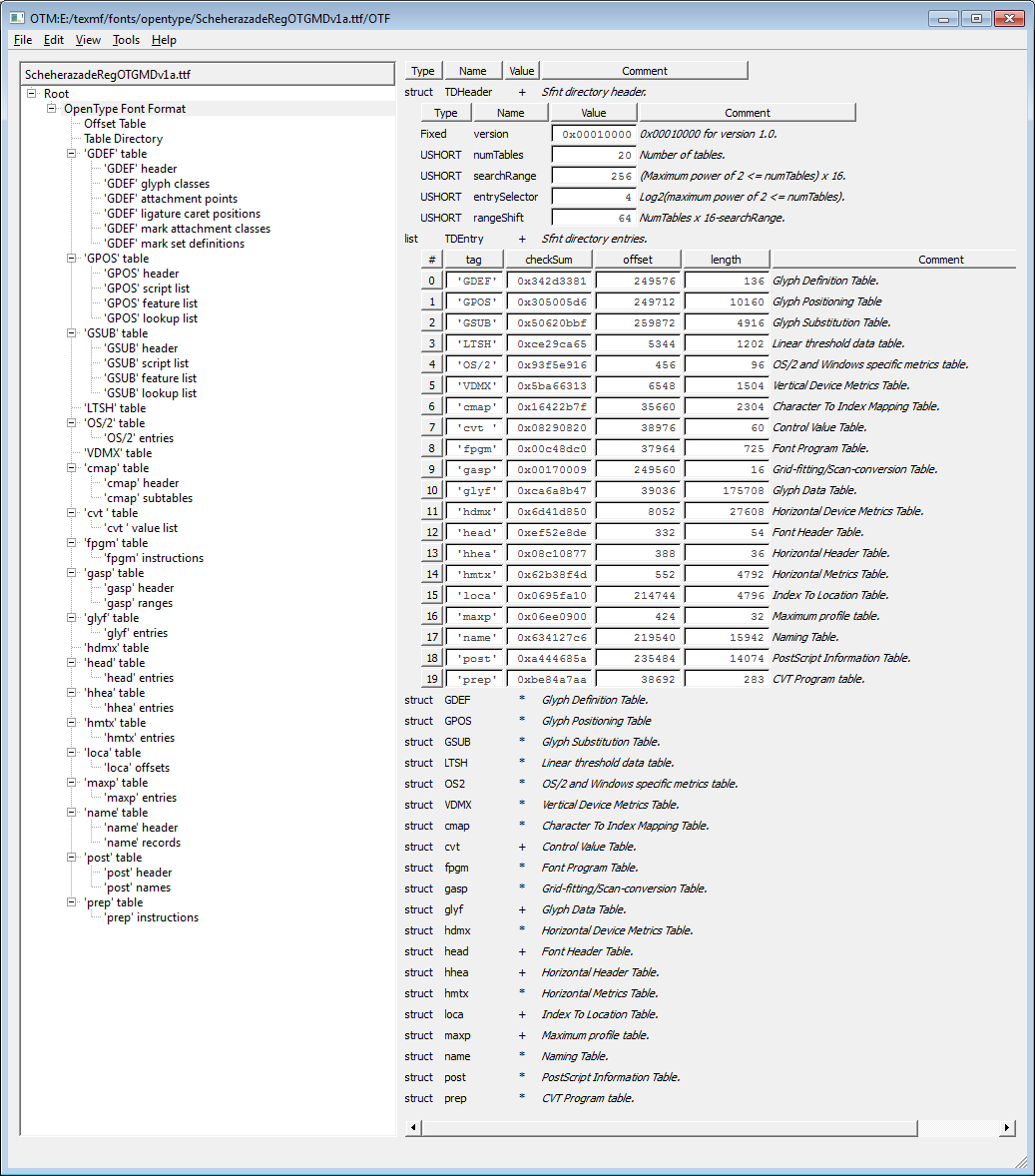
Summary information
Summary of key data contained at the start of the font.
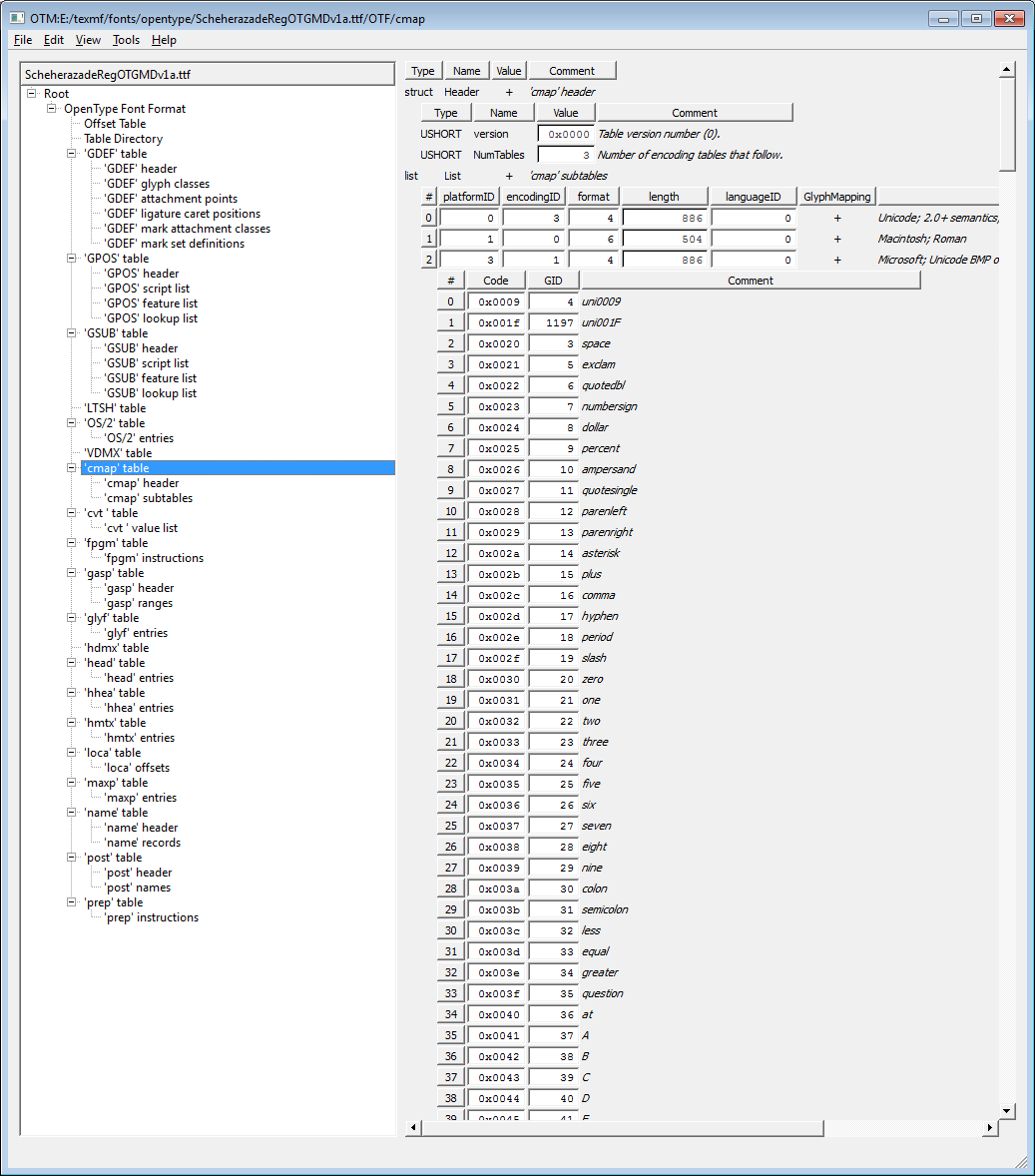
cmap table
The following screenshot shows the font cmap table(s) – the font’s mechanism to map from character codes (e.g., Unicode) to the internal, and font-specific, glyph identifiers (indices).
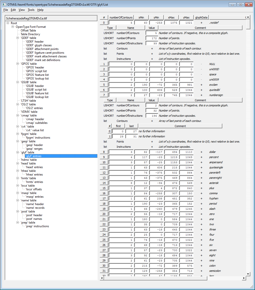
glyf table
Displaying a wealth of information on the low-level data for glyphs.
And finally: Funky effects with multiple words and vowel placement!
(You’ll need to download the PDF or zoom in with the Google PDF viewer). Just to complete the work: “funky effects” with multiple words and vowel positioning according to OpenType mark-to-base rules in the font.
Funky effects with Arabic words
This post covers applying “funky effects” to whole Arabic words – extending the work noted in my previous posts. It was was quite tricky to join a sequence of letters to form whole Arabic words as a single outline path, but I finally got there. This does not yet include positioning vowels according to OpenType mark-to-base rules in the font… that’s next on the list. Code is written in C++ with various classes defined to perform specific tasks (such as write PDF files).
Funky effects with Arabic glyphs!
Over the last few evenings I’ve been exploring Bézier curves and effects that can be achieved through “flattening” glyph paths. I found a great C++ library called Clipper which lets you perform a number of interesting operations on polygons. After you flatten a glyph path you can pass it to Clipper to do all sorts of “funky” things, such as offsetting the Laam-Alef glyph path in the example shown below. The PDF file was generated by the HARU PDF library (written in C) and glyph outlines were obtained using FreeType (also written in C). Well, it’s more interesting than watching the rubbish on TV!
Quick update: Another example with multiple paths in the glyph.
Typesetting Arabic clocks with LuaTeX
Just a short post to share an example of producing clock faces with Arabic numbers using LuaTeX’s nodes and glue. No drawing packages were used, all done with pdf_literal nodes and some basic trigonometry to calculate positions of the numbers, angles for clock hands and values of glue to move things around. I will try to write-up the code/techniques in a future post.