Introduction
This post could easily turn into the length of a small book if I covered all the background material that may be required for a full understanding. I simply cannot justify the time it would take to explore everything in full detail; so I apologize for the brevity if there’s insufficient detail for many readers. In addition, I’ve been rather loose in my definition of “vowels” and should be more precise to distinguish between damma/kasra/fathah and other markers such as shedda, sukoon and so forth.
The joys of TeX
One side-effect of using TeX is being distracted by the typesetting quality of materials you are reading. And this happened to me whilst trying to teach myself some Arabic. I bought many books and began to notice that the quality of Arabic typesetting was extremely variable, even from the most respected publishers. In fact, some of it was atrocious, especially the placement of vowels/markers (damma, kasra, fatha, sukoon, shadda and so forth). It was not simply a question of being “picky”, or mere aesthetics, but it actually impacted on reading the material. Often, lines of fully-vowelled Arabic text were so poorly typeset that it was hard to know which vowel belonged to which base glyph. As a small example, here’s a scan of the word “yawmu” (day) taken from a book that shall remain nameless:
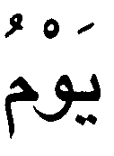
Even to the casual observer it is clear that the marks above the glyphs are very distant from the base glyphs they are supposed to be marking. So, I asked myself “Why”, little did I know that it would result in me being distracted away from studying Arabic to exploring typesetting it instead. To begin to explain the problem, we can replicate the above scan with a little bit of hand-rolled PostScript code. Don’t worry about how I found the appropriate glyph names for use with the PostScript glyphshow operator. The following code initially typesets the word “yawmu” using the default glyph positions and then typesets the same glyphs by applying manual re-positioning/adjustments – moving the vowels/markers closer to the base glyphs and faking a bit of kerning too.
/ATbig /Arial findfont 30 scalefont def
/AThuge  /ArialMT findfont 75 scalefont def

50 250 moveto

ATbig setfont
(Glyphs in their default positions: ) show

AThuge setfont
/uni064F glyphshow %damma
/uni0645.fina glyphshow %meem
/uni0652 glyphshow
/uni0648 glyphshow
/uni064E glyphshow
/uni064A.medi glyphshow

50 150 moveto
ATbig setfont
(Glyph positions manually adjusted: ) show

AThuge setfont
gsave
-2 -10 rmoveto
/uni064F glyphshow %damma
grestore
/uni0645.fina glyphshow %meem
gsave  2 -10 rmoveto
/uni0652 glyphshow
grestore
-15 0 rmoveto
/uni0648 glyphshow
gsave
2 -8 rmoveto
/uni064E glyphshow
grestore
/uni064A.medi glyphshow

showpage
Here’s the resulting PDF:
So, in essence, “poor quality” typesetting of fully-vowelled Arabic can arise from typesetting processes/software that do not make any adjustments to the positions of vowels/markers with respect to the base glyph they are supposed to mark. Naturally, it would be crazy if you had to manually work out the positioning adjustments for each vowel/marker according to the glyph it is marking. Of course you don’t need to do that – if you use high quality OpenType fonts all the necessary positioning data is contained in the font itself. However, the font designer still has to work very hard to put that positioning data into OpenType font to ensure that the myriad of combinations work well – not forgetting that Arabic letters have up to 4 shapes depending on their position in the word (initial, medial, final or isolated) and have a myriad of complex ligatures which also need similar positioning data. Spare a thought for the designers who labour for hours ensuring the positioning data works.
Vowels have zero width
A small but important point to note is that the Arabic vowels (and some other markers) should be designed to have zero width: when you render or place a vowel it does not affect the current horizontal point or position on the page. Clearly, this is very important because Arabic is a joined/cursive script – non-zero vowel widths would seriously interfere with joining the base Arabic glyphs. The zero-width can be demonstrated very simply by amending the above PostScript to display just the vowels/markers: here you can see they all overlap because they do not move the current point after being displayed – because they have zero width.
/AThuge  /ArialMT findfont 500 scalefont def
50 50 moveto
AThuge setfont
0 0 1 setrgbcolor
/uni064F glyphshow %damma
0 1 0 setrgbcolor
/uni0652 glyphshow
1 0 0 setrgbcolor
/uni064E glyphshow
showpage
OpenType features: anchor points (mark positioning)
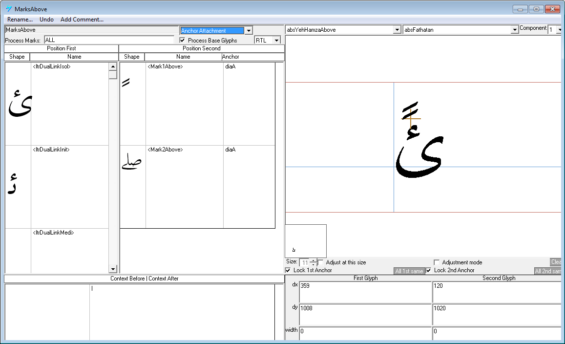
To support high-quality Arabic typesetting, OpenType fonts contain the necessary positioning data to adjust the positions of vowels/markers to move them closer to, or away from, the base glyph over which they appear. So, how is this done? Again, for brevity I’m omitting a huge amount of detail but in essence the process is quite easy to understand. When you think about these positioning issues you need to think about pairs of glyphs: the base glyph – i.e., the Arabic letter in one of its forms, together with the vowel glyph or, to be more general, glyphs which are classified as marks: glyphs that appear above or below base glyphs. For each mark glyph/base glyph pair the mark glyph and base glyph are each given a so-called anchor point, which is simply an (x,y) coordinate pair (in font design space coordinates). Positioning the mark glyph with respect to the base glyph means that typesetting software obtains the anchor points (from the font file) and uses them to make positioning adjustments so that anchor points of the mark and base coincide. Here’s a simplified diagram showing anchors for a damma (mark) and the medial form of kaaf.

The following diagram simulates having displayed a medial form kaaf then the damma (marker) but without the damma’s position being adjusted via the anchor point data. If you look closely, you can see that the two crosses representing the individual anchor points do not yet coincide.

How are these anchor points created?
Well, as you’d expect it requires specialist software and a great deal of time to manually experiment and work out the best (x,y) pairs for marks/bases. Thankfully, for TrueType fonts Microsoft has generously provided an excellent free piece of software called VOLT: Visual OpenType Layout Tool. VOLT allows you to implement very sophisticated OpenType features, not only “mark to base positioning” which is what we are talking about here. If you are interested to explore this technology, you can start with SIL’s Scheherazade Regular (OpenType) developer package which contains a VOLT project file you can load and explore. See the VOLT screenshot below.
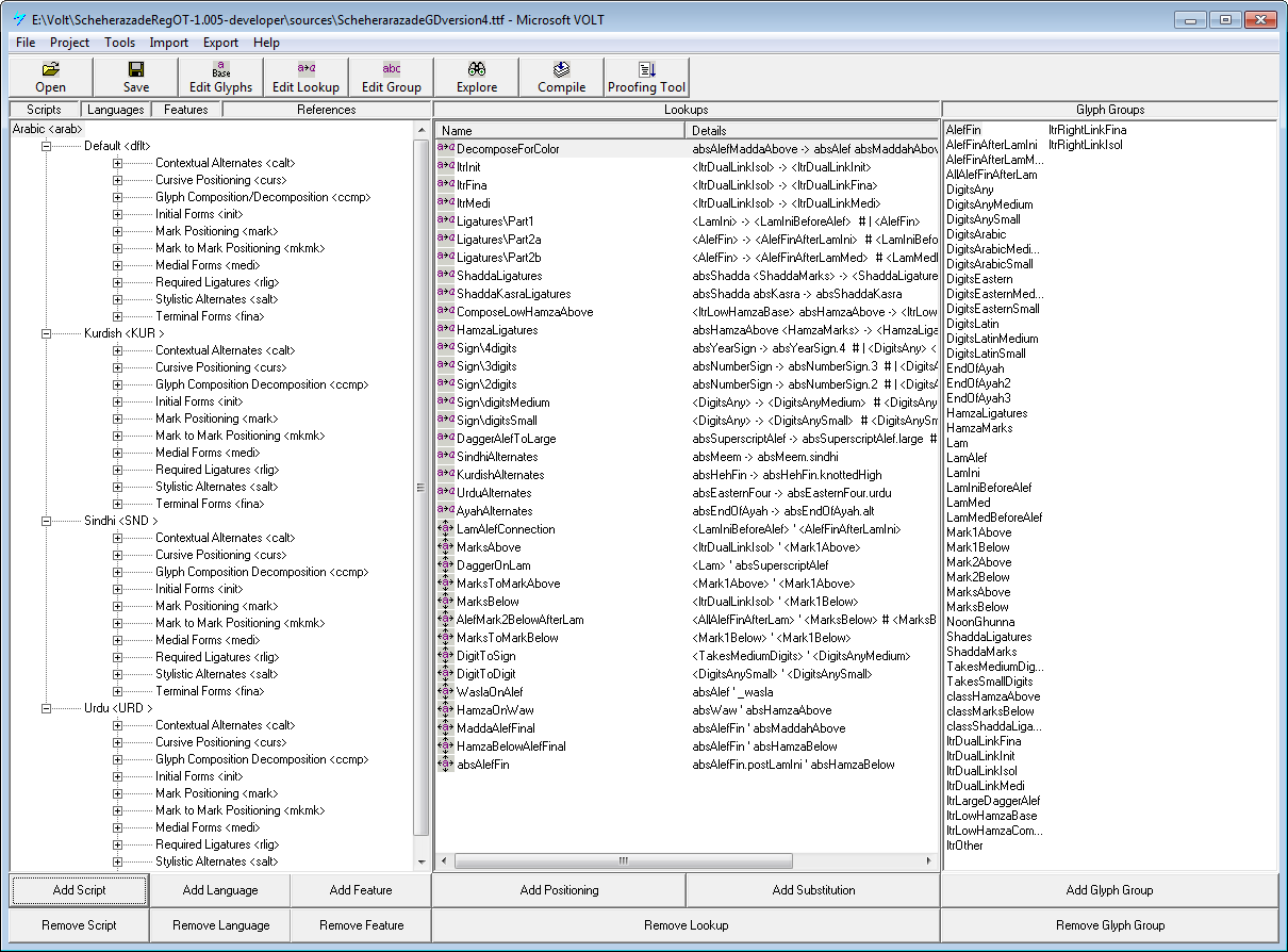
Attempting a VOLT tutorial is far outside the scope of this post. However, here’s a screenshot showing the creation of anchor points – in the lower-right corner you can see coordinate data (in font design coordinates) which are the anchor points: an (x,y) pair for the mark and base glyph.
How do you actually do the adjustment?
Well, here is where it get pretty fiddly because you have a number of coordinate systems in play plus you are dealing with right-to-left text positioning – and it all depends on the software you are using. Perhaps the easiest option (well, the easiest at 3am as I finish this article!) is to think of the damma’s position undergoing simple repositioning as indicated by this vector diagram:

In the above diagram, the vectors r1 and r2 represent the positions of the anchor points, with vector rt indicating the translation you need to apply to the damma in order for the anchors to coincide. Now, it is of course complicated by the fact that the anchor point coordinates are defined using the design space of the fonts, so you obviously need to scale the anchor point values according to the point size of your font: simply (pointsize/2048) for TrueType fonts. You obviously need to account for the coordinate system into which you are rendering the glyphs. So, if you have placed the medial kaaf at some position (a,b) on your page so you need to work out the translation vector rt to place the damma in the correct location.
And finally…
Good night, I’m going to get some sleep. I’ll fix the typos later 🙂
And really finally…
Just to note that you can think of the mark’s anchor point as translating the origin of the mark glyph: